Learning CSS can be challenging. If you are just just a beginner with CSS you will start to feel frustrated with trying to move your div around to the place you want it to stay. We all want to build a perfect website that is responsive to our mobile users and trying to roll out your own custom css to do that can be hard. Luckily for us now, we are able to use some CSS framework that gives us the grid system.
What are some CSS frameworks we can use?
Before we get into the grid system here is a list of CSS frameworks that gives us the grid system:
Materialize is my personal favorite. It gives me the grid system and more styling options for my HTML. I will be using its documentation to show you some examples of how to use the grid system.
What is the grid system?

The grid system gives us 12 columns that will always be equal to each other no matter the size of the browser. Before we specify how many columns we want we want to wrap our code in a <div> with a class of ‘row’.
The advantages here is that you can specify how many columns a <div> may have. So let’s say you want to have 3 columns for your website to make it nice and pretty like this.
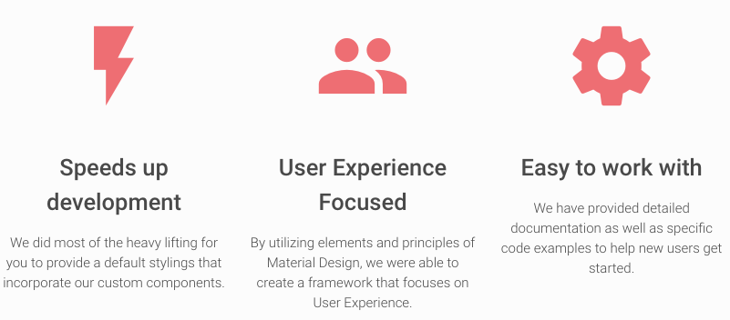
I placed the 12 column grid system above to show you how the 3 columns div line up
<div class="row">

  <div class="col s12 m4 l4">
    <img src="lightning.jpg" />
    <h2>Speeds up development</h2>
    <p>We did most of the heavy lifting for
    you to provide a default stylings that incorporate
    our custom components</p>
  </div>
  <div class="col s12 m4 l4">
    <img src="people.jpg" />
    <h2>User Experience Focus</h2>
    <p>By utilizing elements and principles of
    Material Design, we were able to create a
    framework that focuses on User Experience</p>
  </div>
  <div class="col s12 m4 l4">
    <img src="setting.jpg" />
    <h2>Easy to work with</h2>
    <p>We did most of the heavy lifting for you
    to provide a default stylings that incorporate
    our custom components</p>
  </div>

</div>
Notice that the wrapping div has a class of ‘row’. Within that div there are other div that has the class of ‘col s4 m4 l4’. Do not worry about what the letter in front of the 4 mean yet, but focus on 4. Each one of these div with a col 4 means it will take 4 of the 12 columns available to it.
Responsiveness
Another advantage of using the grid is responsiveness to the browser size. When creating websites we must think of the user first. What if the user is on mobile or a tablet? Their screen will affect how your website will look. The grid system solves the problem of different screen size. Now lets get back to the div with the class ‘col s12 m4 l4’. The ‘s’, ‘m’, and ‘l’ is referring to the size of the screen. So ‘s’ is small, ‘m’ is medium, and ‘l’ is large. If its on a small screen it will take all 12 columns, 4 columns on medium, and 4 columns on large. A small screen would be considered mobile phones, medium would be tablets, and large would be a desktop size screen. Being able to specify how big you want your content depending on the size of the user screen will greatly improve your sites user accessibility.
Thank you for reading this blog I hope this will greatly improve your CSS skills and help you build cool websites that benefits from the grid system.